OVERVIEW
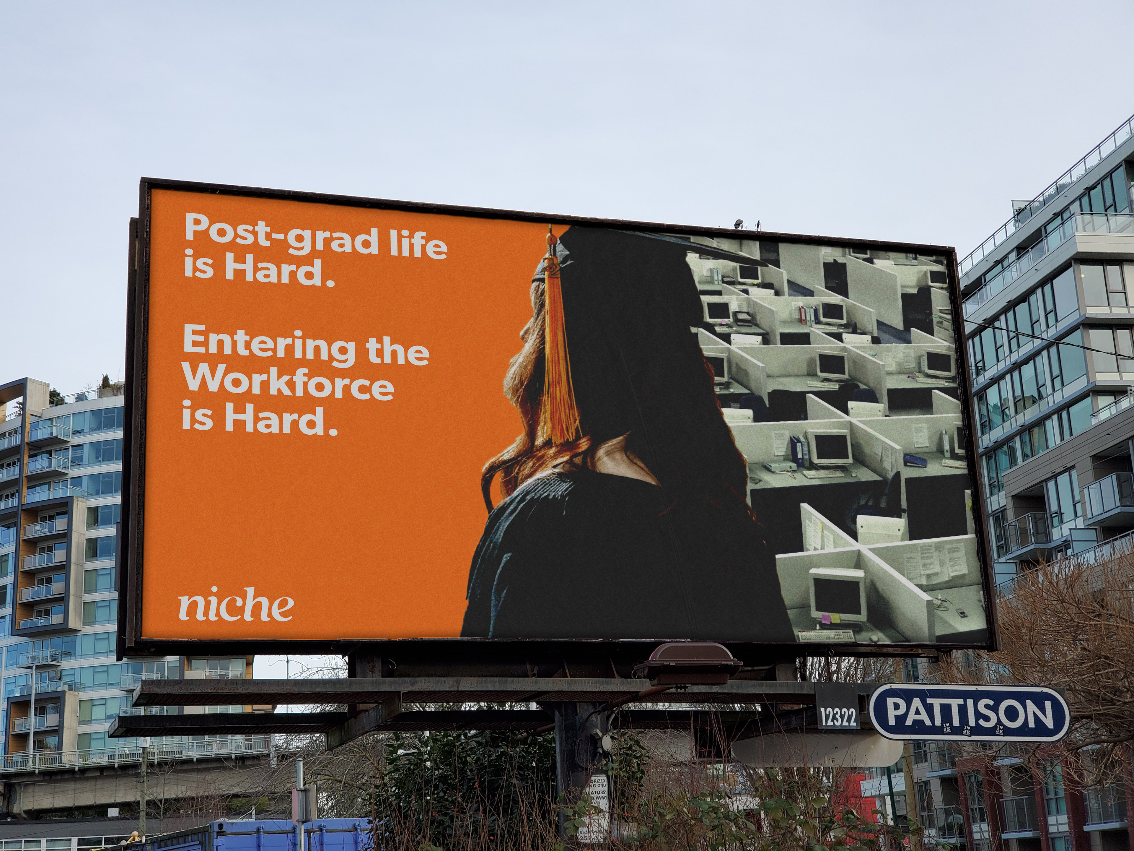
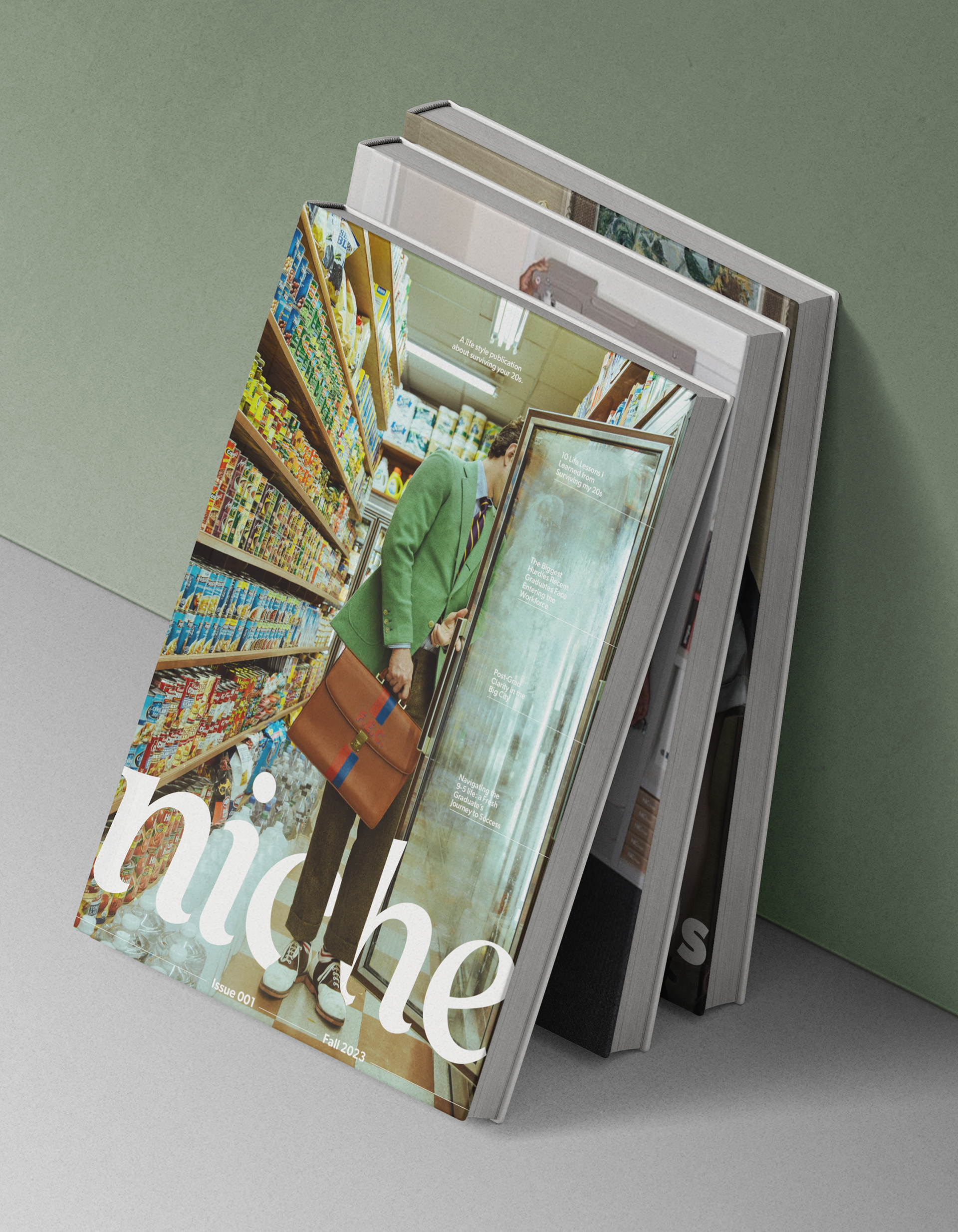
Niche is a lifestyle magazine that targets recent college graduates beginning the next chapter in their lives. This publication focuses on the excitement and challenges of newfound independence, such as living alone for the first time and maintaining a work/life balance. Entering the workforce—especially in a big city—can be daunting, but Niche exists as a guide to support young adults and provide comfort with interesting visuals and relatable content.
OBJECTIVE
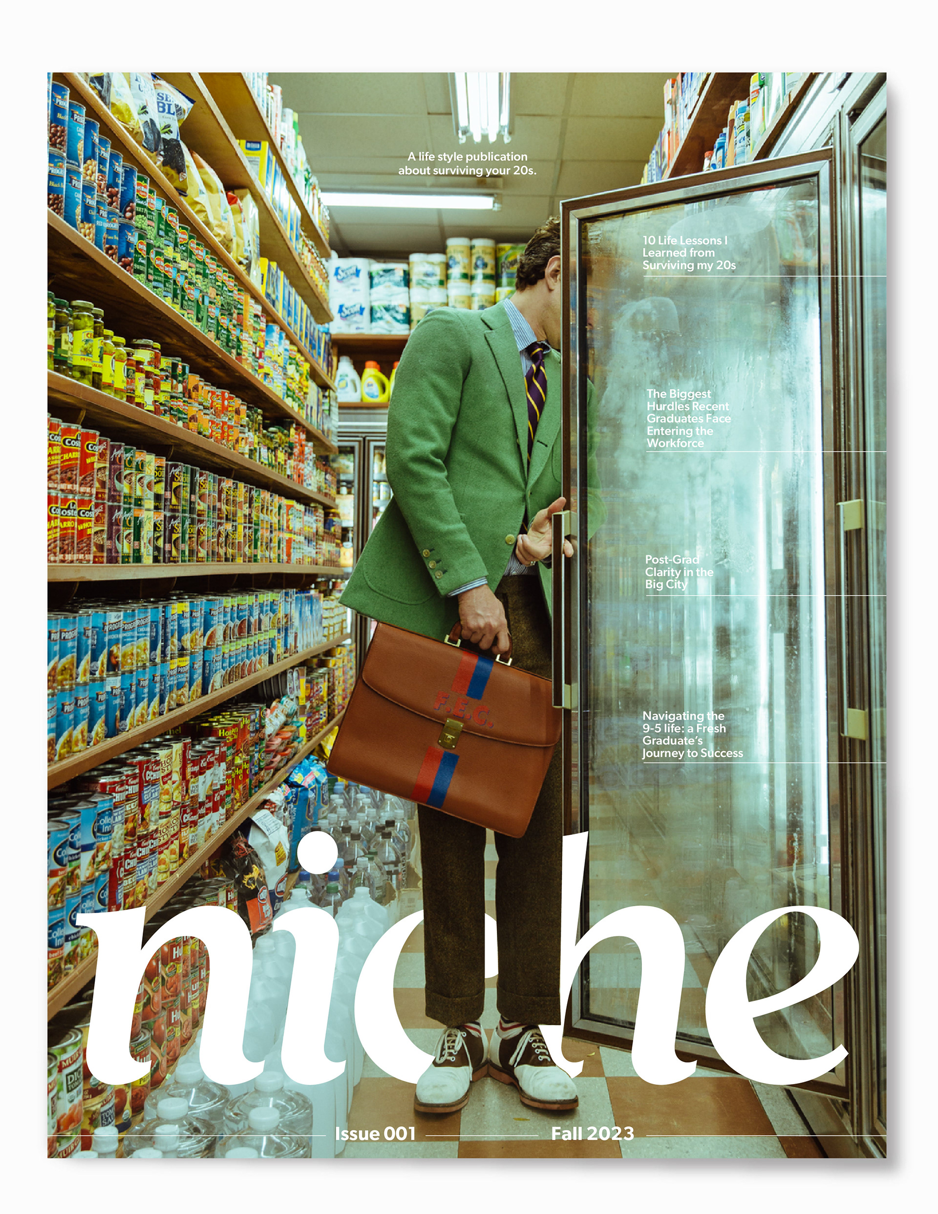
Using typographic theories and principles, the goal was to explore typography through identity development. Through the use of form structure and style, the intention was to create a wordmark for a magazine that communicates meaning and begins to build a visual language.
FALL 2023 / TYPOGRAPHY II / ILLUSTRATOR, INDESIGN, PHOTOSHOP
PROCESS
The initial goal leading to the final wordmark was to create a form that had structure in the original typeface, as well as a funky/off-balanced added element. I started with display and high contrast typefaces that either had an existing sense of chaos or an element I sketched.
FINAL WORDMARK
MOODBOARD
PUBLICATION LAYOUT
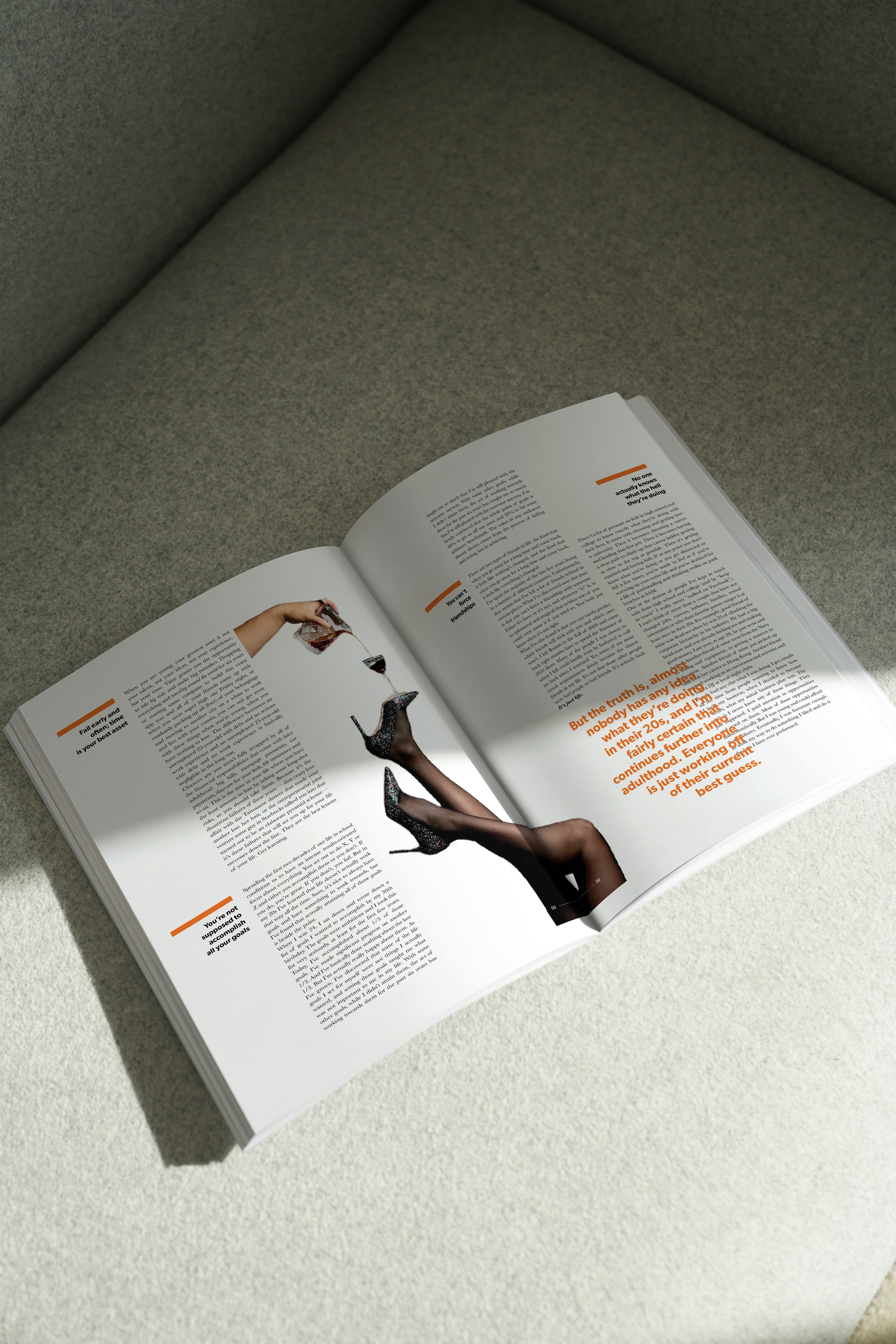
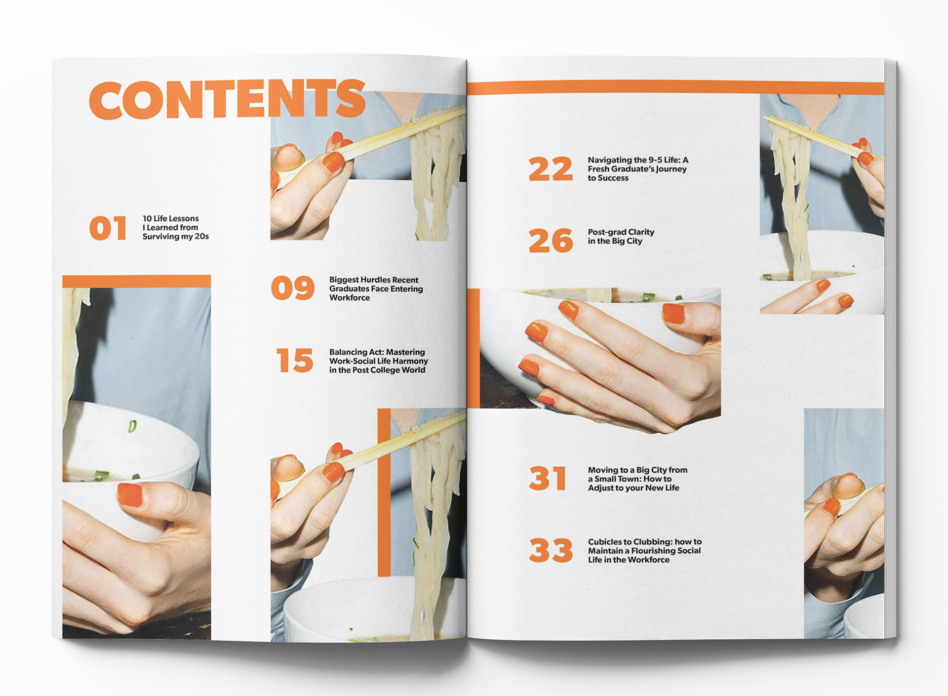
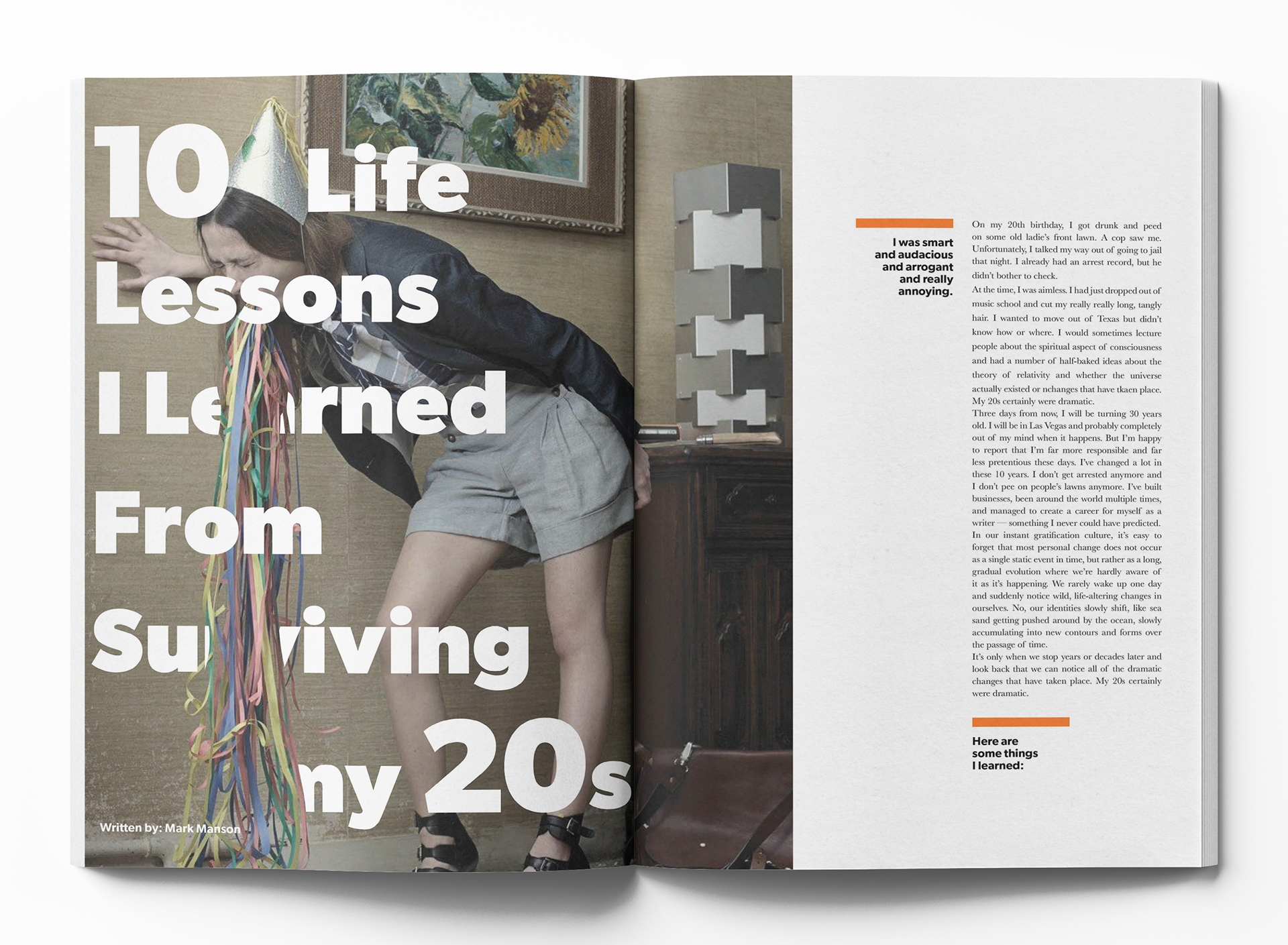
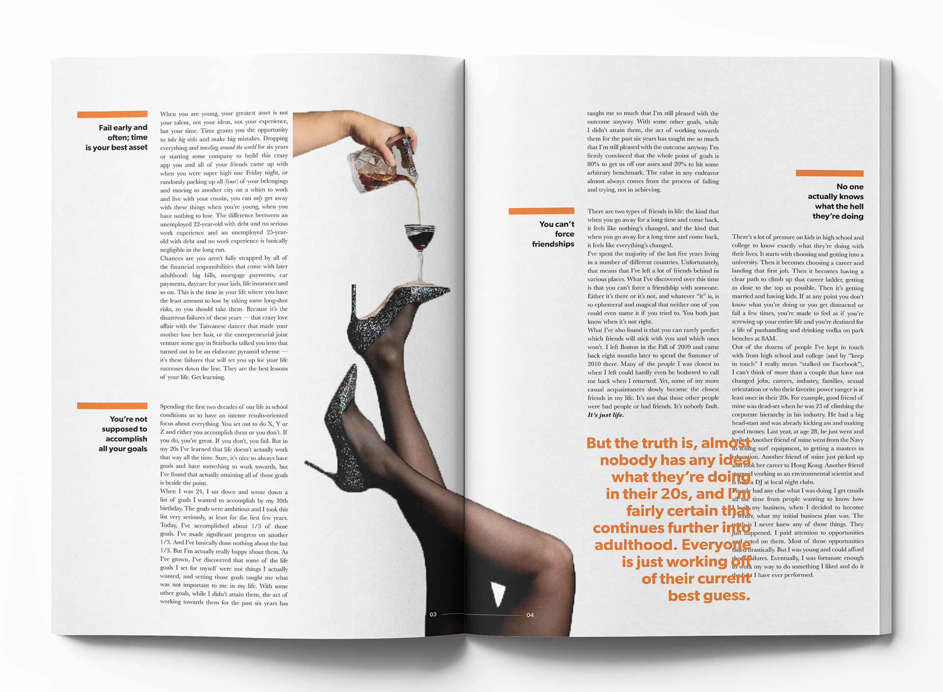
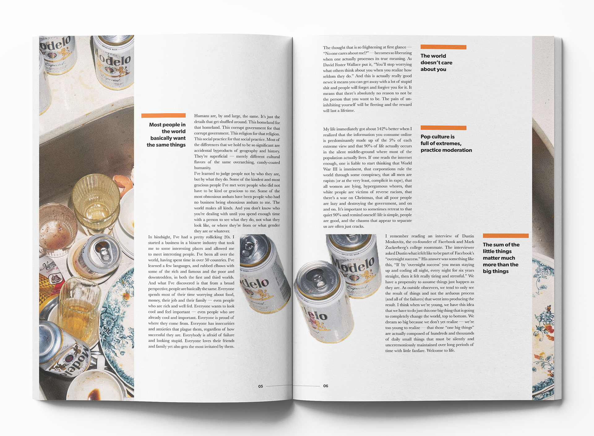
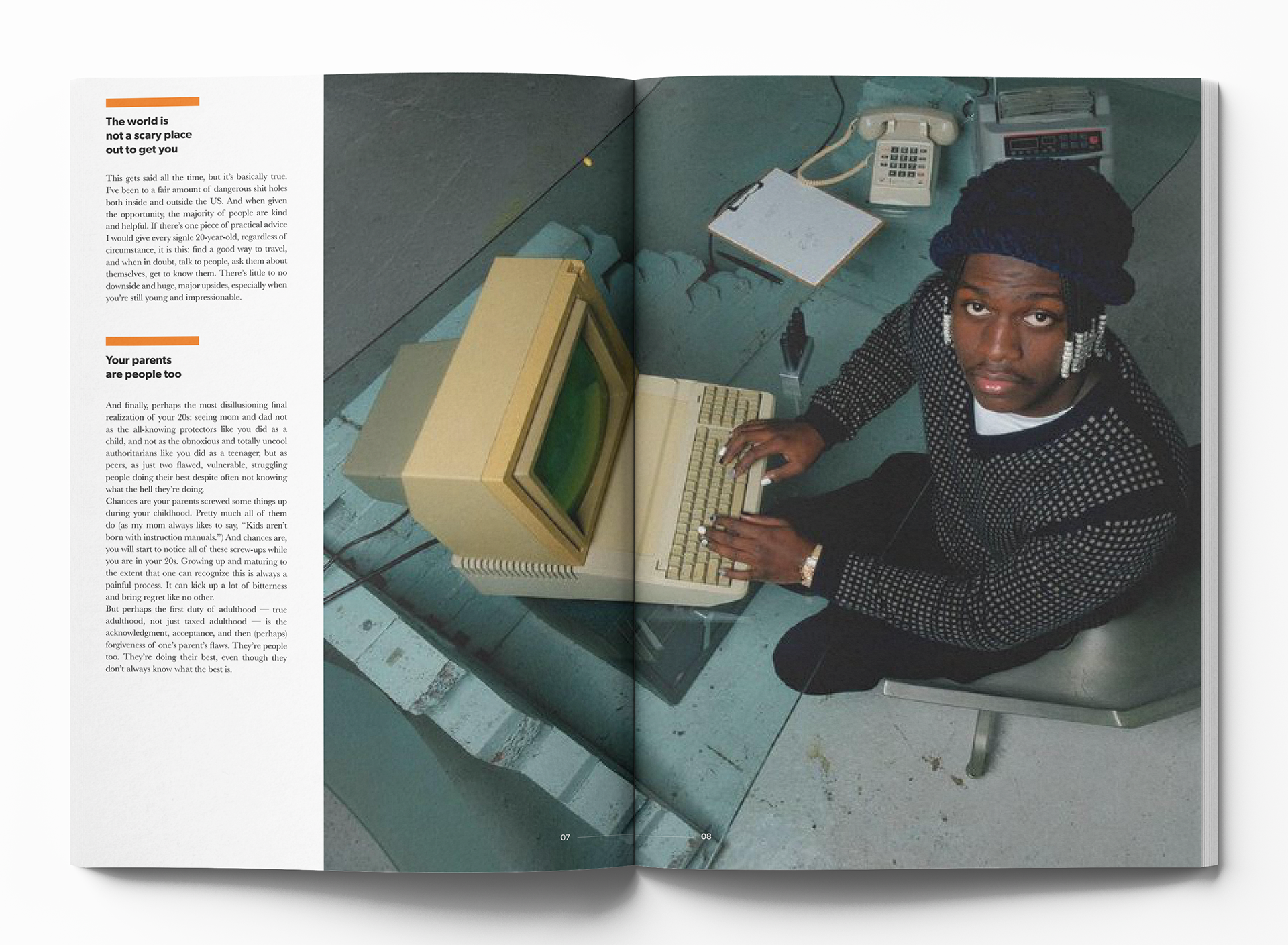
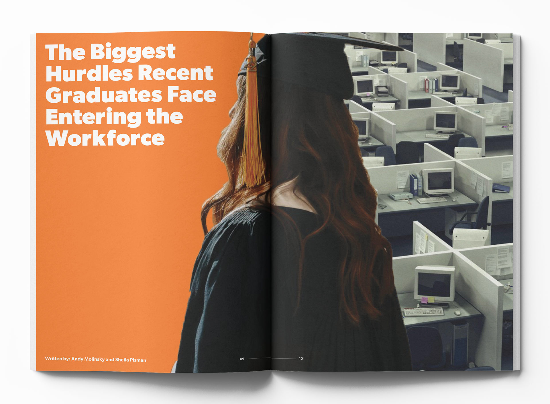
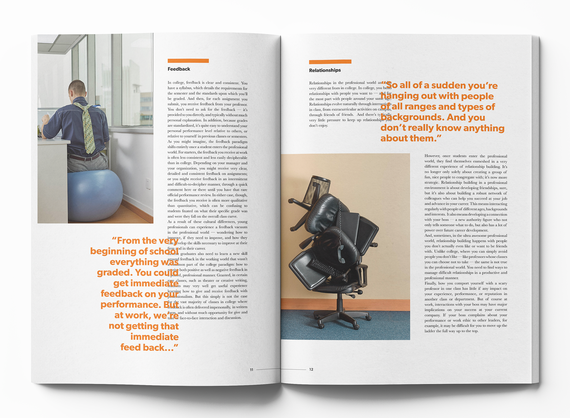
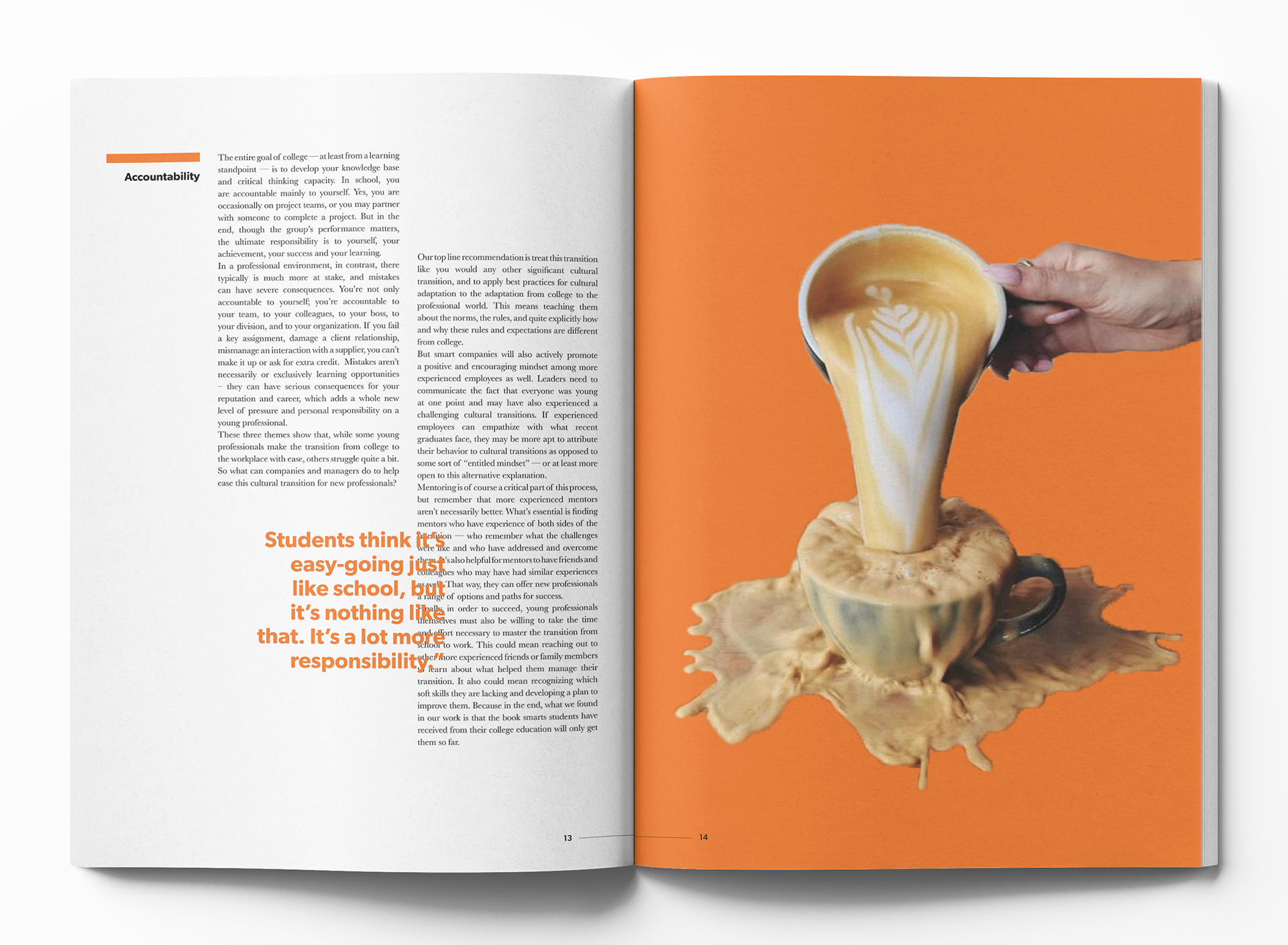
The initial intention of the layout is a bold collision of structured energy and dynamic chaos, reflecting the balance of comfort and chaos. A strong yet flexible grid serves as the foundation, allowing for moments of disruption that guide the eye through each spread. A mix of clean type, bold imagery, and layered copy creates an unapologetic design that represents being in your early 20s.
MOTION GRAPHICS
I decided to create two motion graphics to create a dynamic and visually engaging marketing component for Niche. The goal was to create a deeper connection with the audience and tell a story that illustrates the essence of the publication.